Website of a charity providing for families of fallen first responders
Jump to:
Project Info / Research / Style Exploration / Initial Mockups / Final Iterations / Prototype / Next Steps
Role:
UI, UX, IxD
Client
100 Club of Chicago
Tools Used:
Adobe Photoshop, Invision
Project
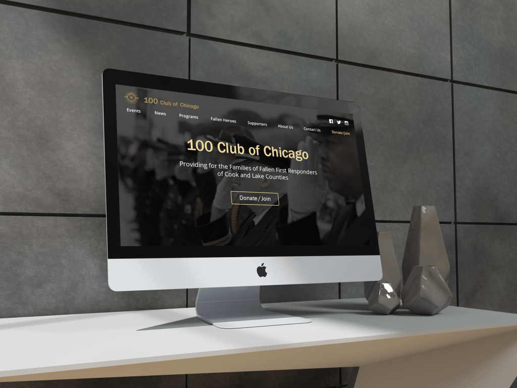
100 Club of Chicago provides financial and emotional support to the families of first responders (such as policemen and firefighters) who lost their lives in the line of duty. To honor these heroes and their history, the club holds events and gathers support through donations and other organizations’ contributions. Marking their 50th anniversary, they sought to refresh their web presence by updating their website.
My team’s goal: Redesign the website to be more modern and better achieve the club’s goals, which are to have visitors learn about the club, join, and donate.
Research
After analyzing the existing website, I found it had:
- Heavy amount of content
- Lack of organization of information
- Unclear navigation and CTA’s
- Outdated visual design
It needed simpler, more effective ways to get its messages across and for visitors to take action.
Card Sorting
We conducted a card sorting test to find how the client envisioned the organization of the website’s content.
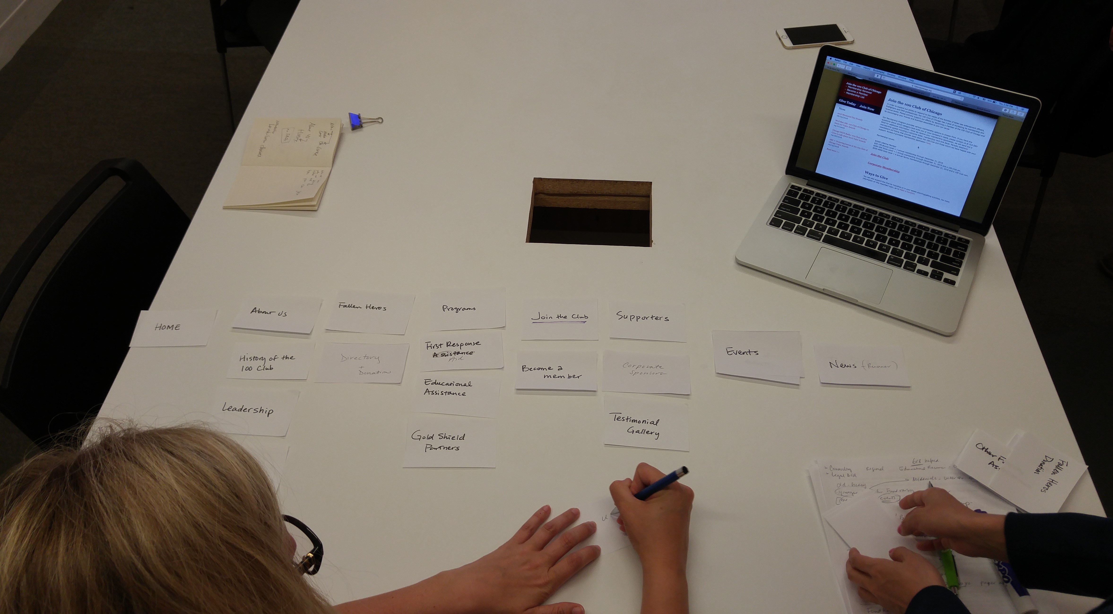
My resulting site map:

Style Exploration
20 Second Gut Test
We conducted a 20 Second Gut Test to get an idea of the visual style our client preferred, showing her screenshots of various charity, non-profit, and emergency relief websites.
Themes that she responded well to were:
- Big photos
- Intuitive top navigation
- Prominent CTAs and current events information
- Numbers showing organization’s achievements
- Black and white color scheme for a historical feel
- Flat, sleek, minimal design
- Full-width and open space
Visual competitive analysis
Themes we observed in other charity and non-profit organization’s websites were:
- Minimal and concise information
- Infographics to show progress
- Information in card style presentation
- Slightly rounded buttons for a friendly look
Style Tiles
I followed patterns and themes from the other charity sites as inspiration.
‘The Seal’
- Color palette is based off the colors of the club’s 50th anniversary seal logo and their Police Week website
- I used these colors to have feelings of trust, reliability, and brightness
- Video is an engaging way to inform visitors
‘Royal Berry’
- Color palette is based on the feelings of reverence and honor for the heroes central to this organization
- Photo with people in it will help inspire empathy within the audience
‘Nature’
- Used calmer, gentler colors of nature to represent growth and support to follow the organization’s concept of helping families with loss
Client Feedback:
- The client preferred my style tile “The Seal” for the colors and more streamlined look, breathing room, and white space.
- She liked the card pattern I used, and the prominent “Donate” and “Join Us” primary action buttons on my “Royal Berry” tile since those were major goals of the website
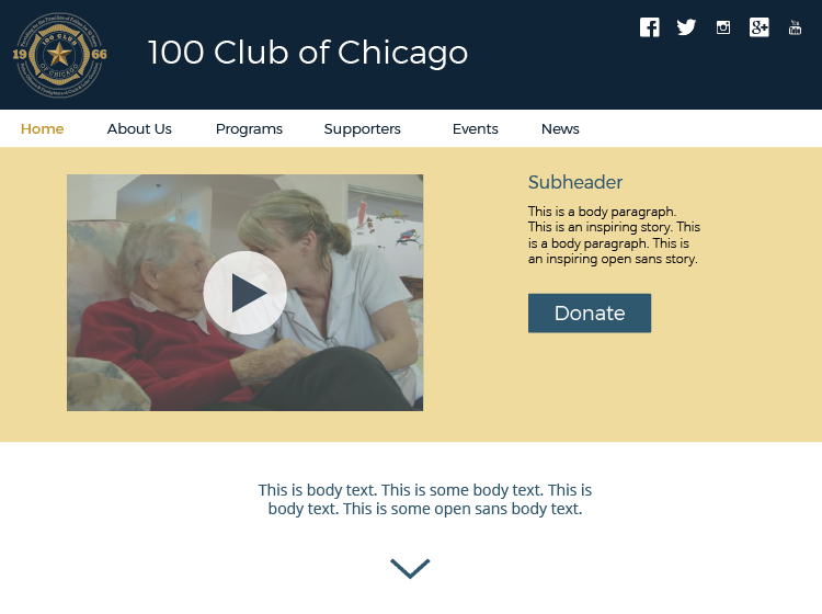
Initial Mockups
First, we made the Homepage and the Programs page. I focused on making the website content, navigation, and style more streamlined to get the message across and enable users to complete tasks in the shortest, most efficient way possible. I took only what was relevant and necessary in the existing website pages.
Homepage
- Each section on the page has a preview of information of another page on the website
- Information and arrangement of sections are based on the card sort results and importance to the user
My initial wireframe

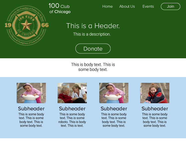
Initial Mockup
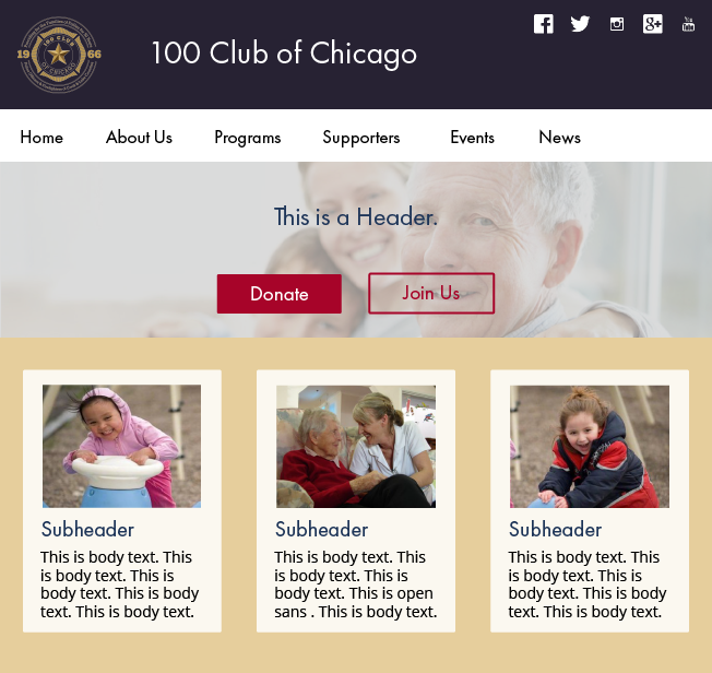
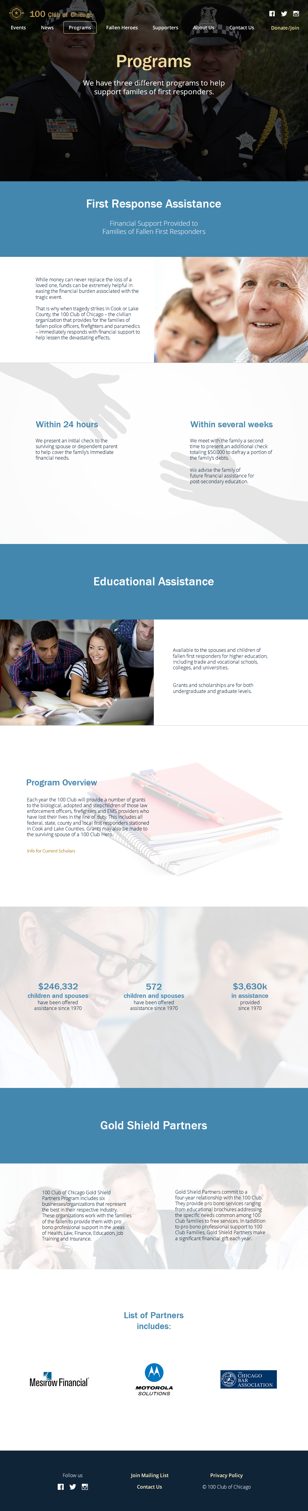
Programs page
- Structure is similar to the Homepage’s
- The backgrounds are light to maintain text legibility and breathing room.
My initial wireframe
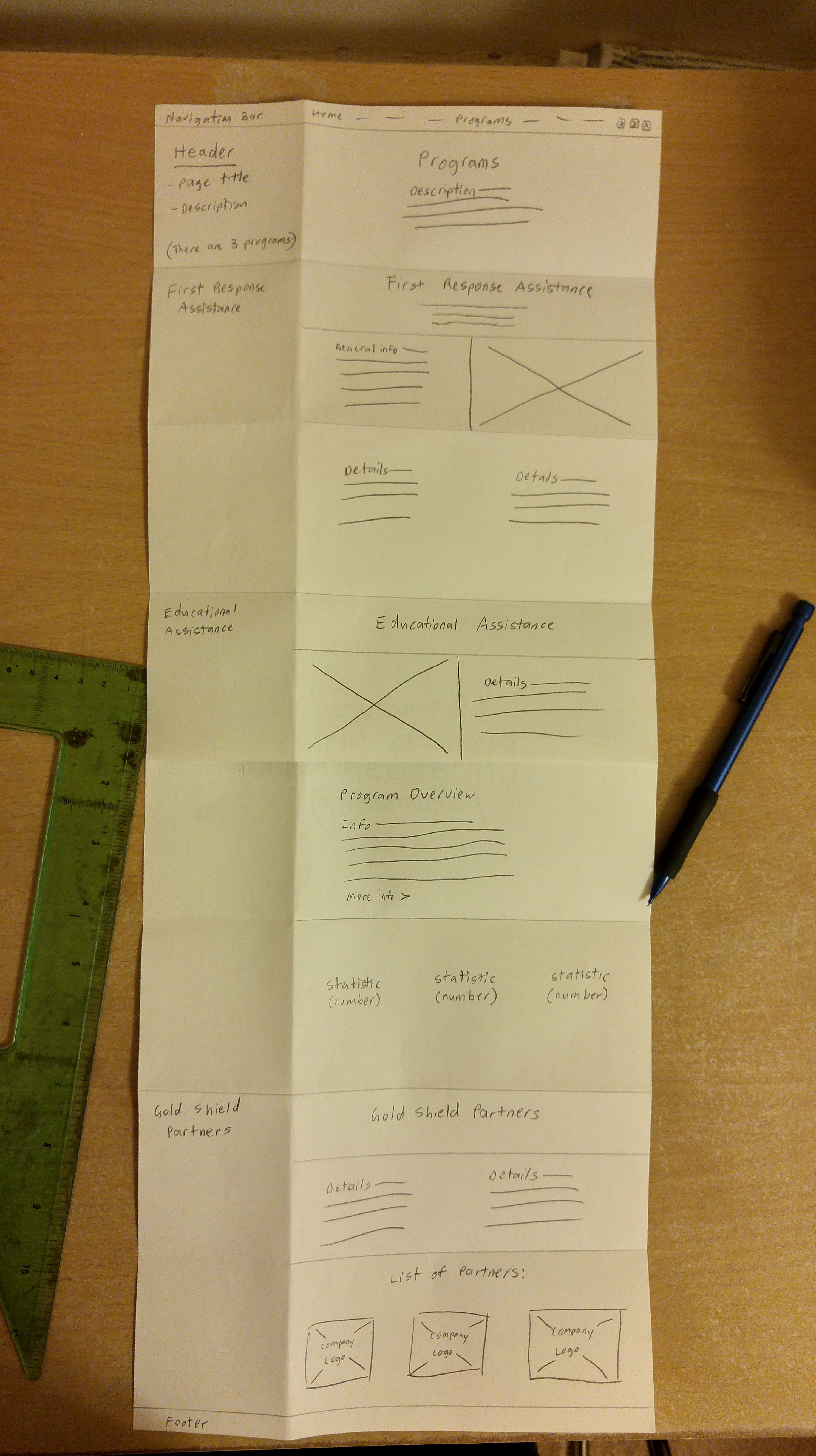
Initial Mockup
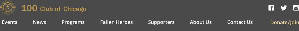
Navigation bar
- Fixed (remains visible as the user scrolls on the page)
- Box surrounds text link of the page the user is on
- Disappears when the user scrolls down and reappears when the user scrolls up

Client Feedback:
- The client liked the Programs section of my Homepage, since it contains information about why visitors should donate
- The About Us section was not needed, because people tended not to look at that information
- Preferred showing progress using numbers like on my Programs page rather than a progress bar like on my Homepage, because the statistics of the organization’s achievements were better shown that way
Final Iterations
After getting feedback from our client, we created the rest of the key flow pages: Events, Contact Us, Donate and Join. We also created the Fallen Heroes page since that subject was central to the Club’s purpose, and a mobile version of the Homepage.
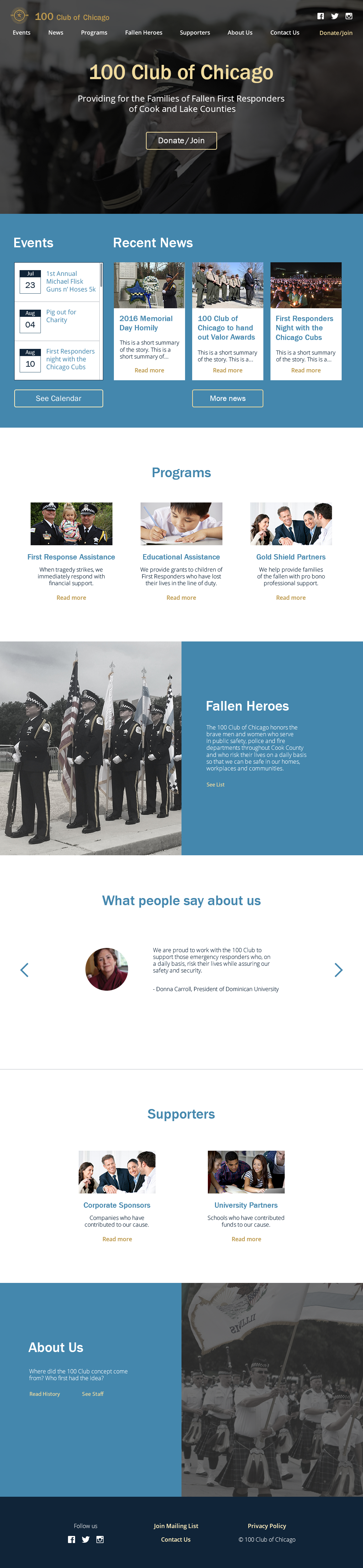
Navigation Bar
- The navigation bar is now two levels so the Club name is visible without cramming the navigation area
- The logo links to the Homepage, and the “Donate/Join” button is visible on every page
Homepage
Things I did while iterating:
- Changed the “Testimonial Gallery” link to a testimonial slider to be more engaging
- Removed the progress bar since it didn’t have potential use in the organization
- Changed the typography to make hierarchy of the text clearer
- Revised the content and color scheme of the background to make the layout more seamless

Programs page
- Overall kept the same except for the section header background color

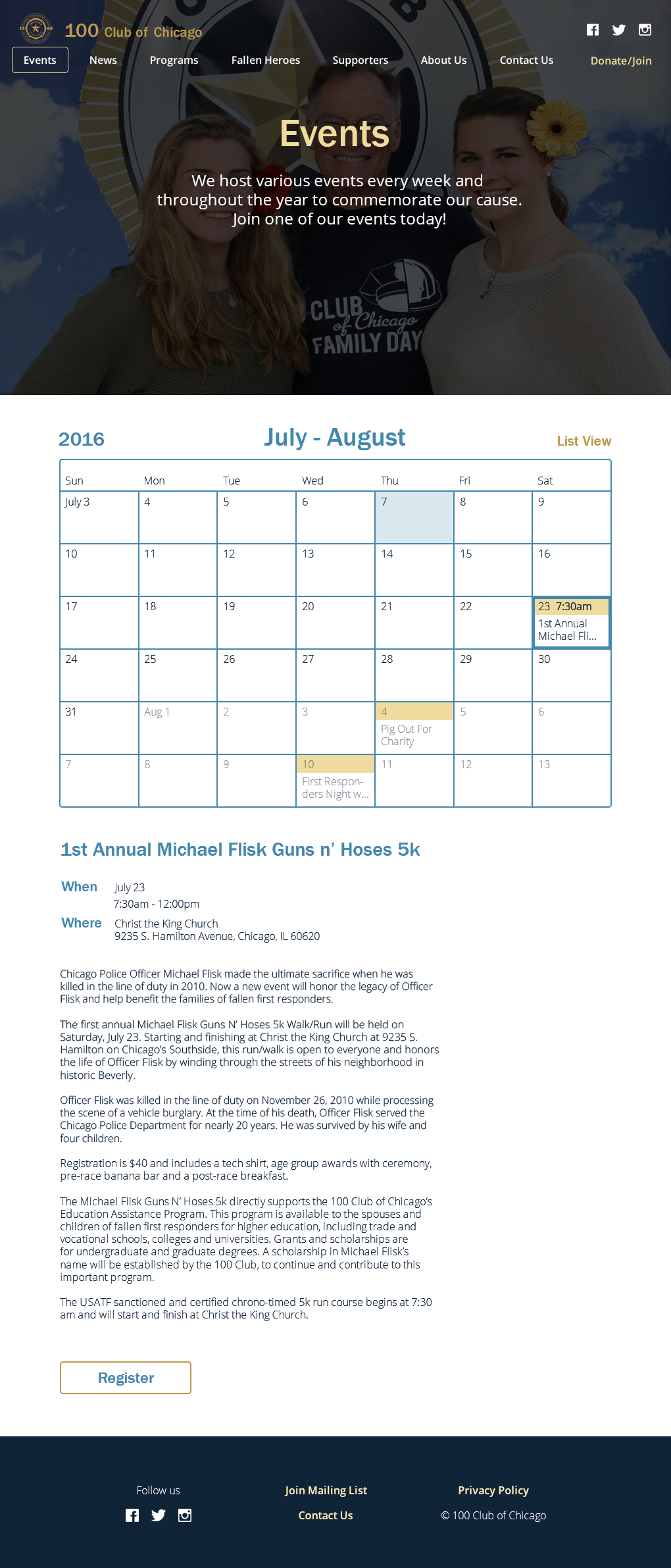
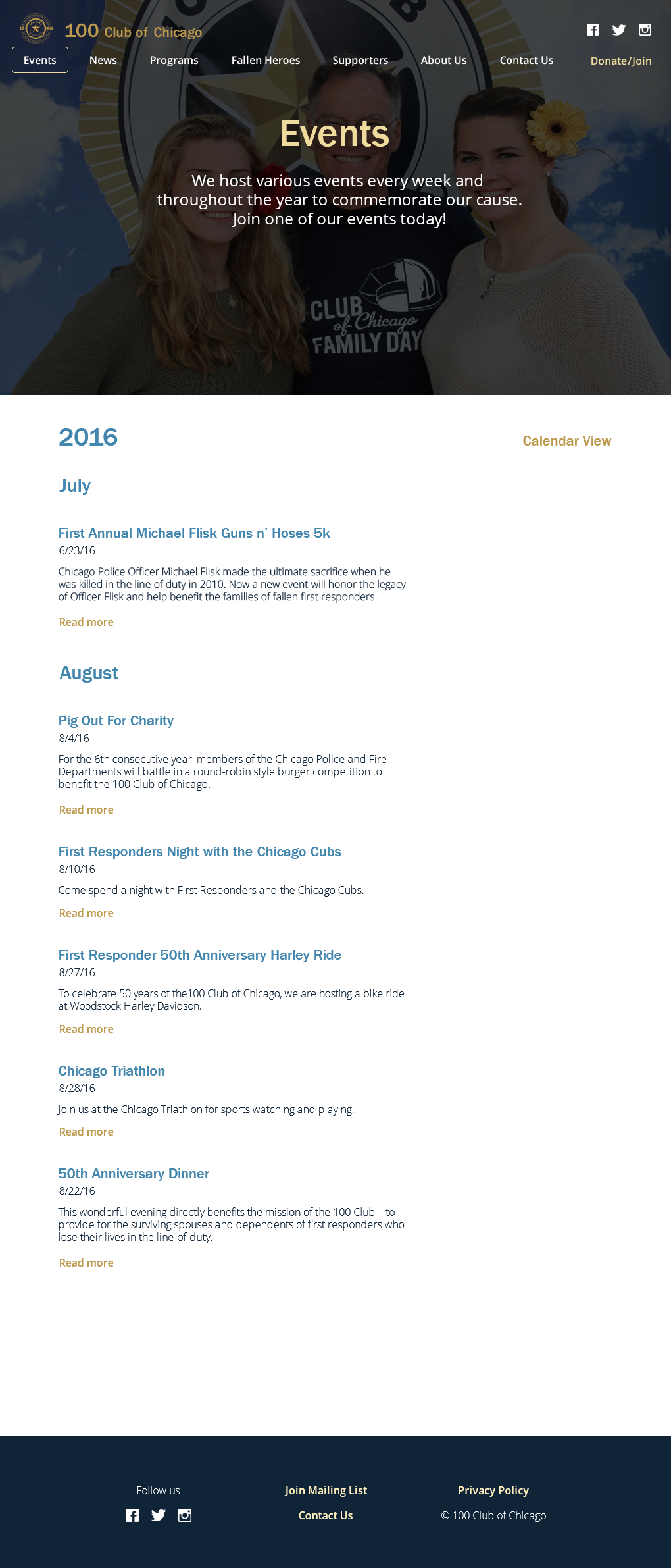
Events
I created two alternating views to show events:
Calendar view
- Enables user to see an event’s date across a relative span of time.
- On the calendar, users can click on event dates to see its details
List view
- Clicking “Read more” will take the user to the event details in the Calendar view
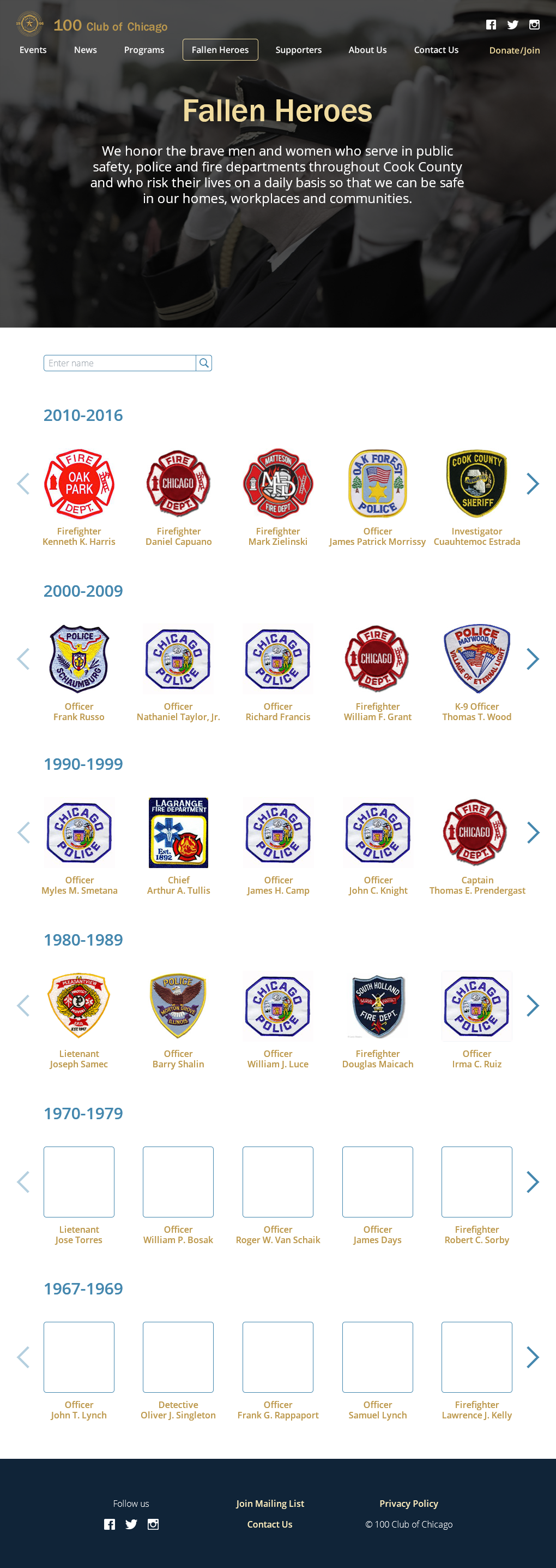
Fallen Heroes
- The carousels showing each decade’s heroes allow access to all the names while staying on the same page
- Clicking on the names or badges leads to more information about the person
- Placeholders for people who didn’t have badge images
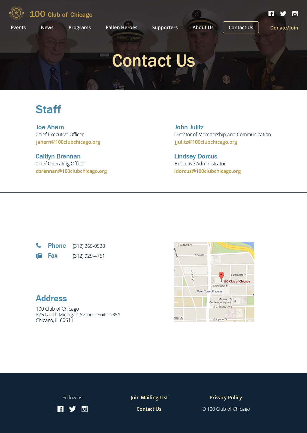
Contact Us
- Related information is grouped together to be succinct and organized
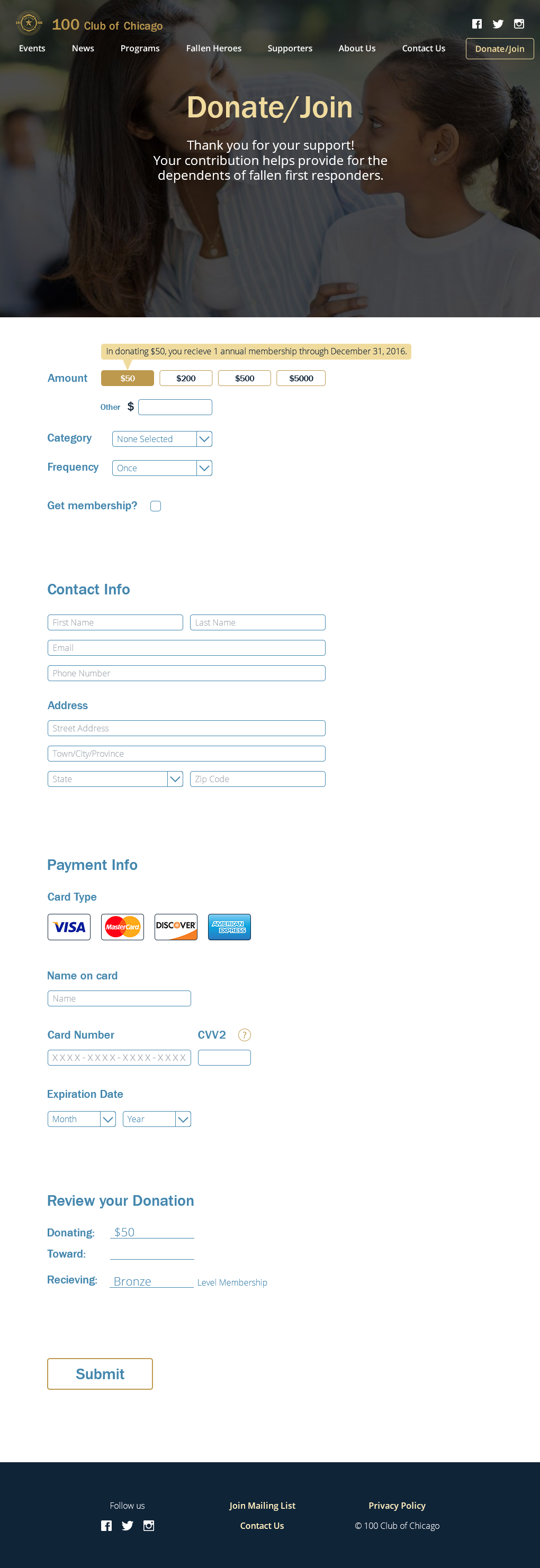
Donate/Join
- I created one page to complete both tasks of donating and joining
- The form is created to be as simple as possible
Mobile Homepage
- I omitted the less important sections (Testimonials and About Us).

Interactive prototype
Click for Invision prototype (opens in new window)
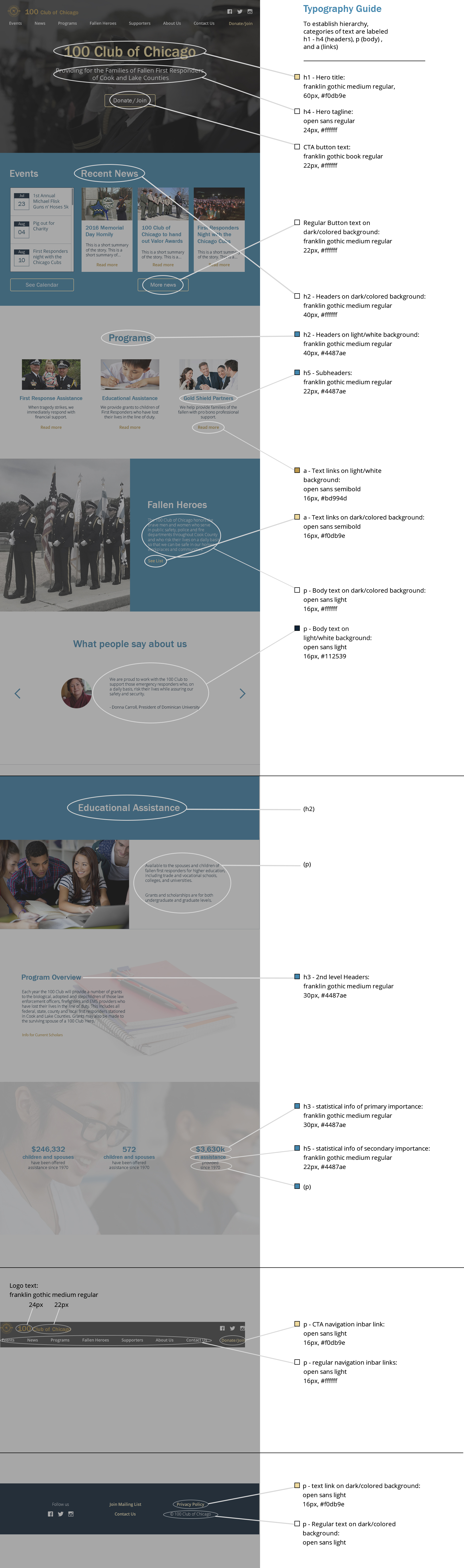
Style Guide
Next Steps:
Since we didn’t go through a UX phase in this project, we suggested a few things for the client to consider:
- Figuring what their range of users are—what are the goals of primary, secondary, and edge-case users?
- How information would be updated—will users be able to look at past events in addition to upcoming ones?
- Ability to search through pages.
Insights
- The card sort and 20 Second Gut Test was useful in gathering information and ideas for more effective solutions.
- It was helpful to communicate with the developers along the process. Knowing their thoughts and preferences helped me in making decisions on how to present deliverables, such as the structure of my design files and the language in my style guide.
- Establishing style guide material during the process of my work to helped in staying consistent in applying styles throughout my designs and sped up my workflow.
- It is helpful to ask the client about both what she liked and didn’t like in order to have more well-rounded feedback. For example, I asked if there were particular things about the style tiles she didn’t choose that made her favor the one she did like, which made for a more inclusive learning experience.

