UK government website whose purpose was to bring all their information in one place
Jump to:
Project Info / Webpage Redesign / Iterations and Other Pages / Prototype
Role:
UX/UI
Tools Used:
Adobe Photoshop
Project
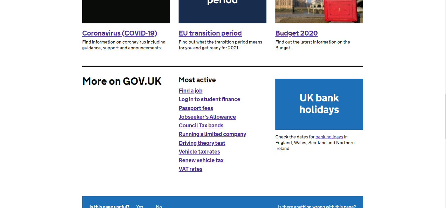
Gov.uk is the UK government’s website whose purpose is to simplify things for people looking for information about public services. However, the format in which the information was presented was disorganized and drab.
My goal was to make the website a more pleasing experience to browse for information by making it more organized and visually appealing.
Redesigning the Webpages:
Homepage
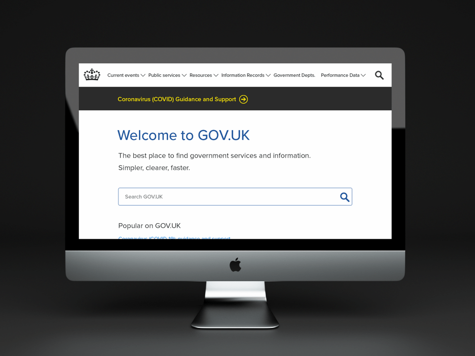
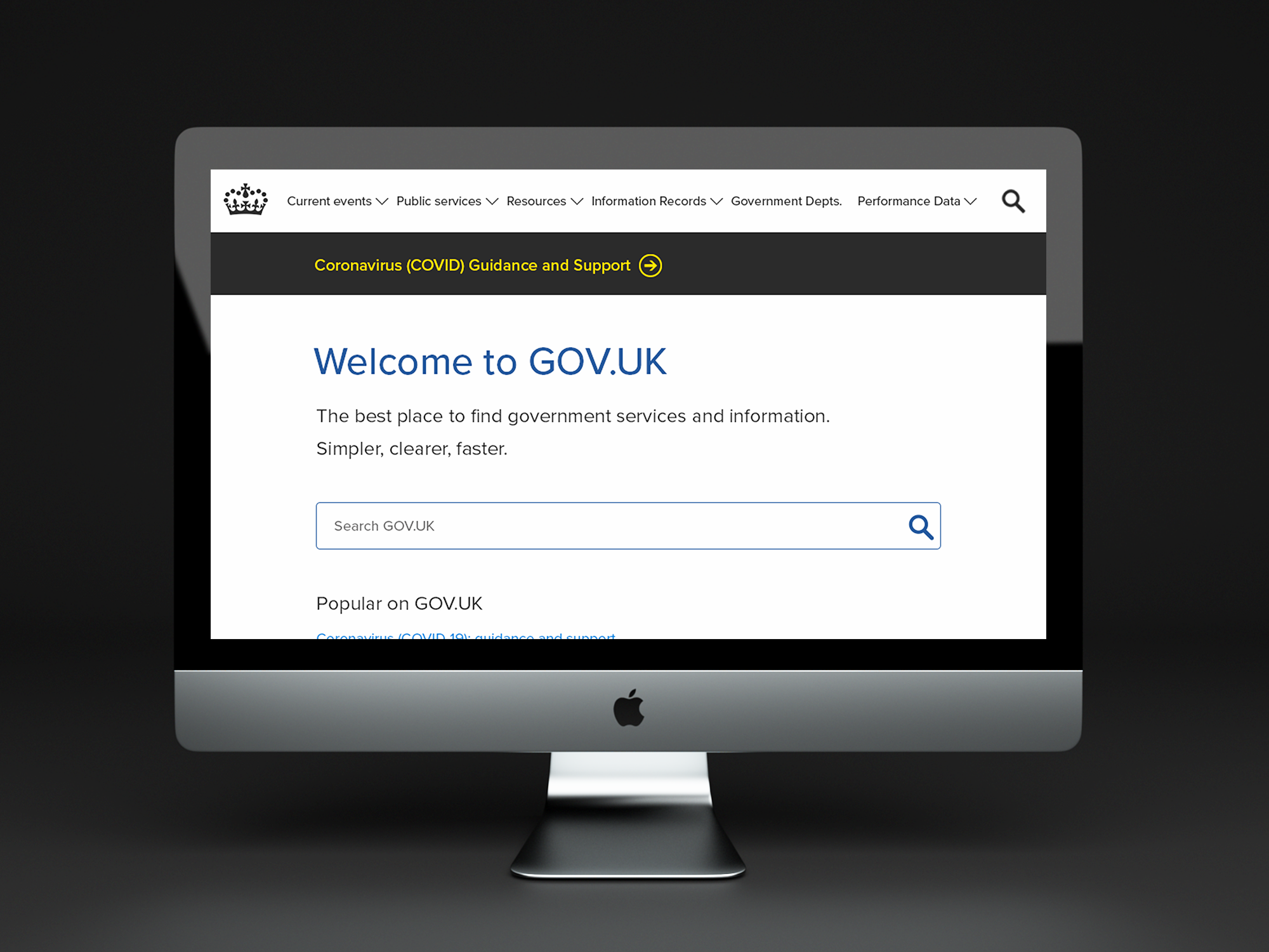
Existing Page:
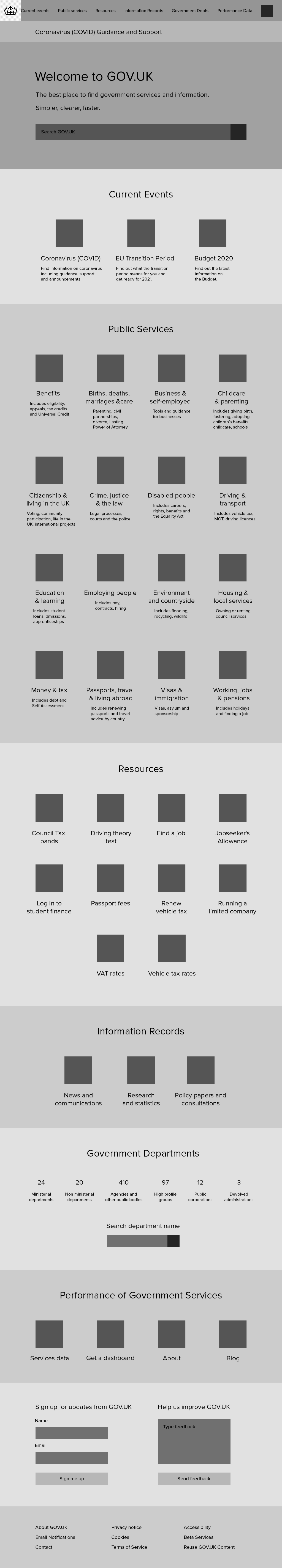
Redesign’s Initial Wireframe and Mockup
- Colored icons for more visually appealing content
- Organized information by sections containing links leading to other pages
- Navigation bar at top on every page, allowing the user to get to subpages
- Sitewide search bar in navigation bar and in header

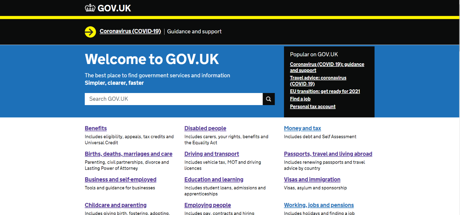
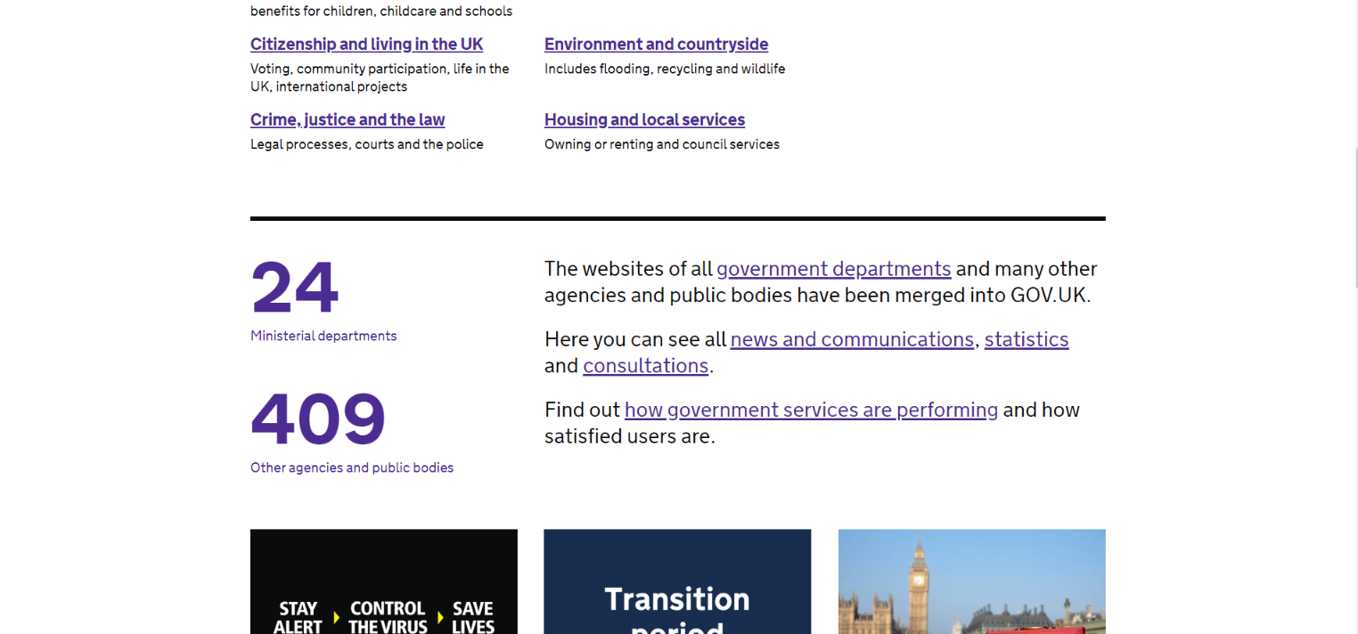
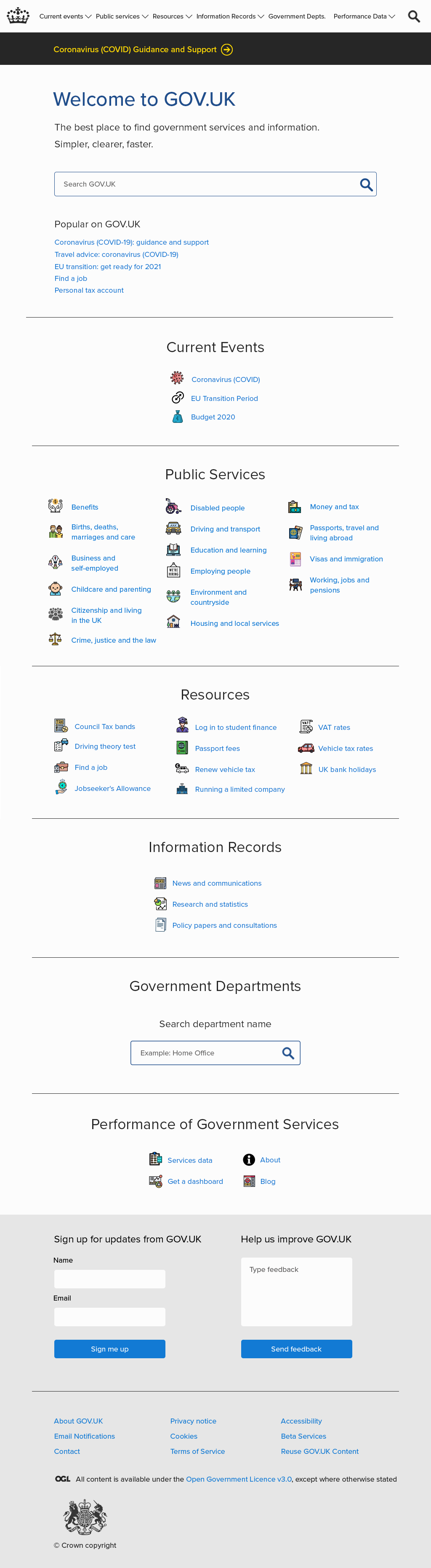
Homepage Iteration
After getting feedback I realized the need for visitors to get information quickly, so I redesigned the Homepage:
- Showed more content at a glance.
- Placed important content first that visitors would likely want to see most
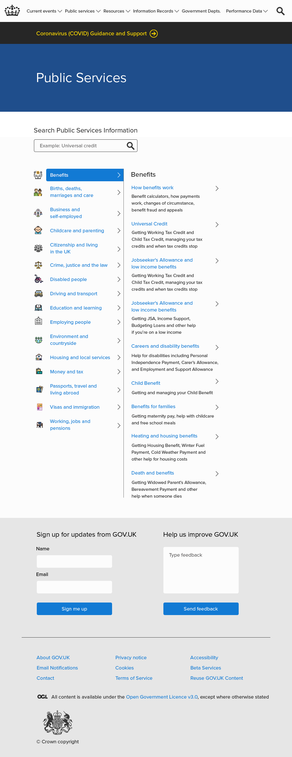
Public Services Page
- Used basic structure of existing website page, as it was relatively effective
Information Records Pages
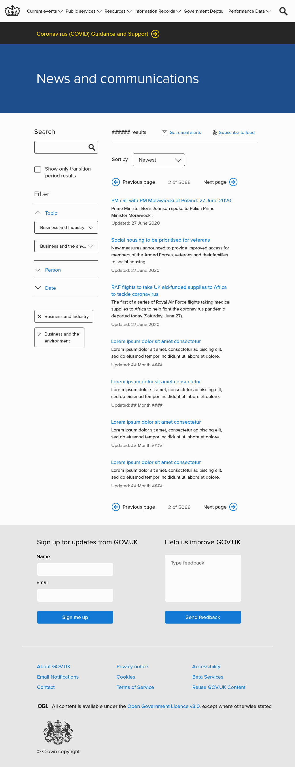
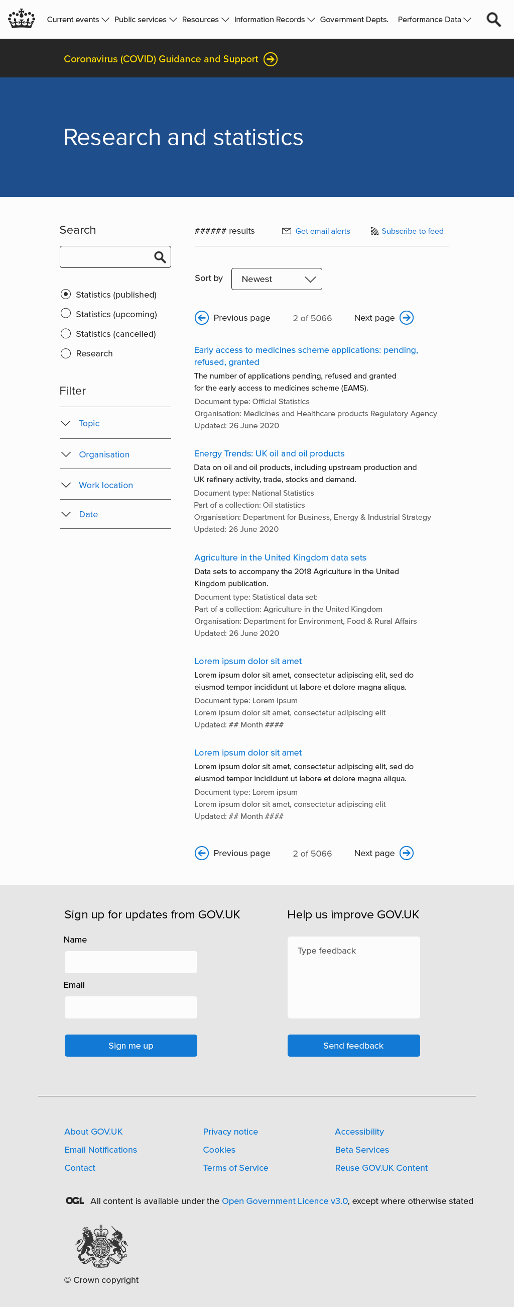
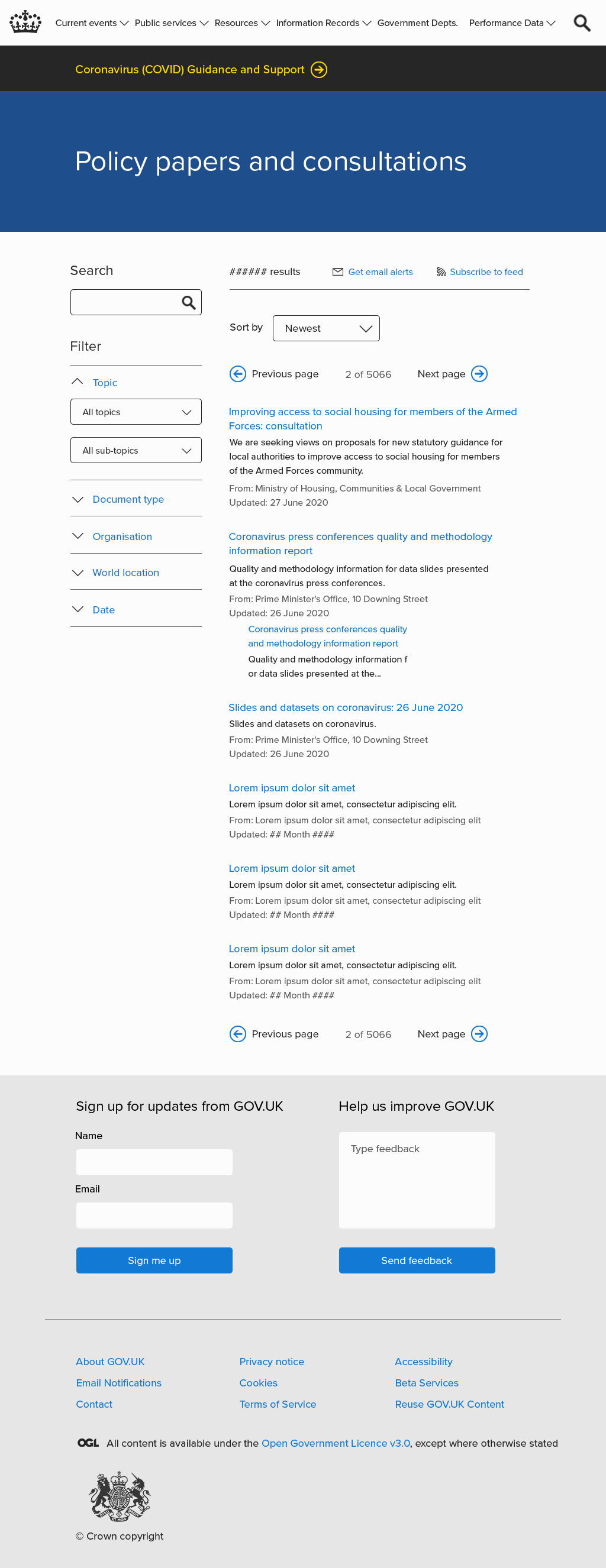
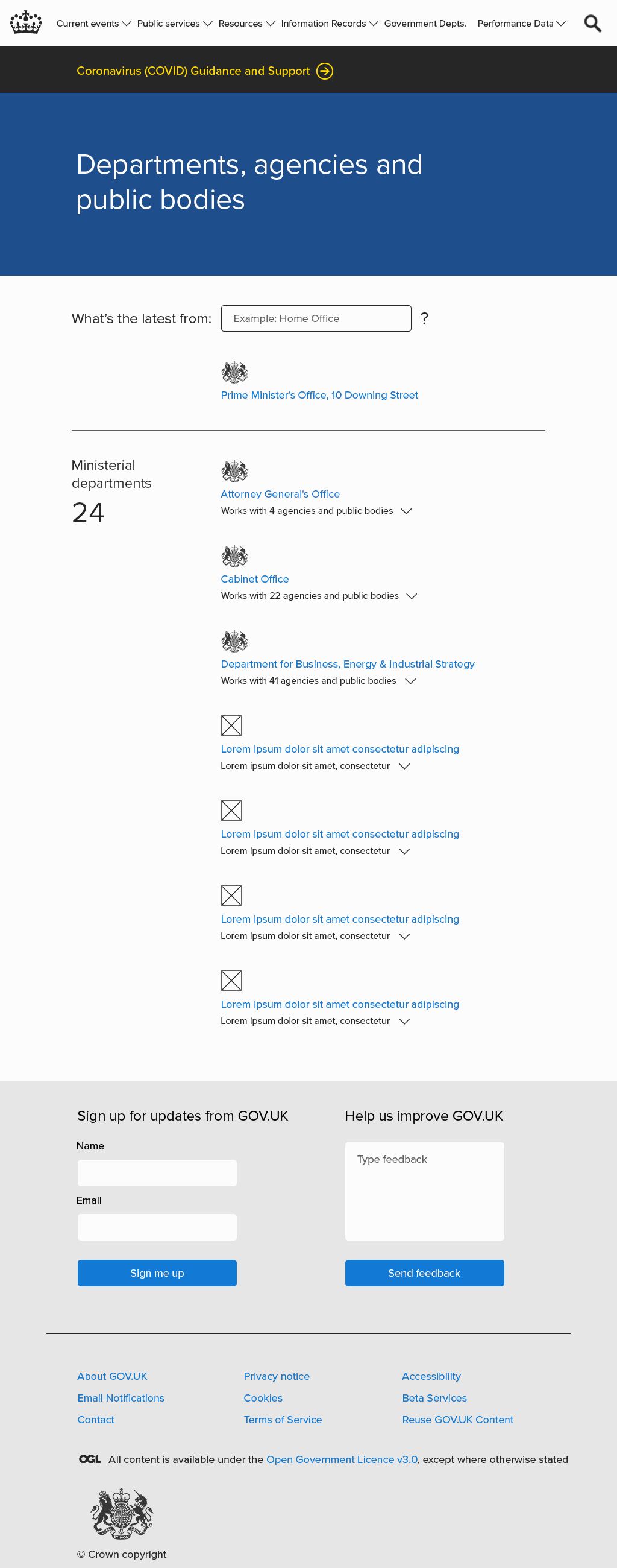
For these three pages, I also used the same basic structure of searching, filtering, and showing content.
News and Communications
Research and Statistics
Policy Papers and Consultations
Departments, Agencies, and Public Bodies
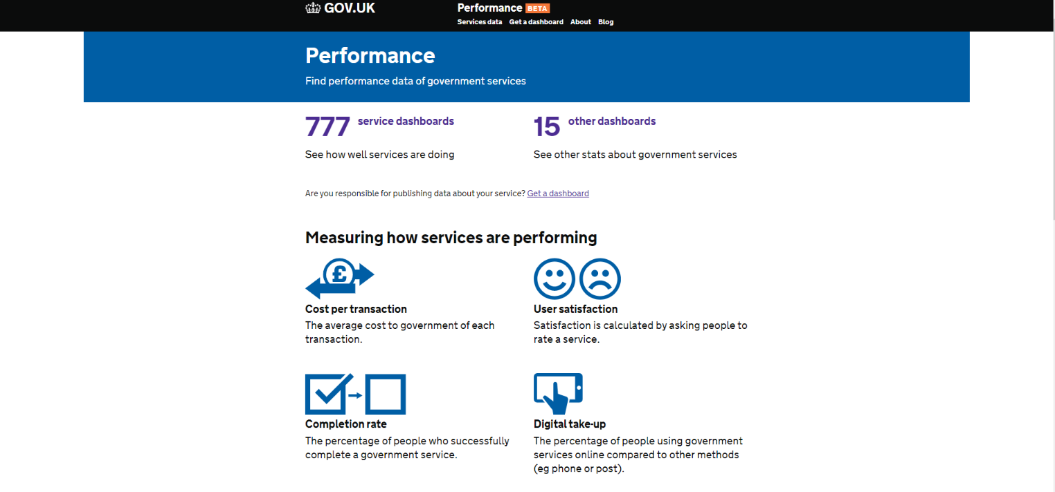
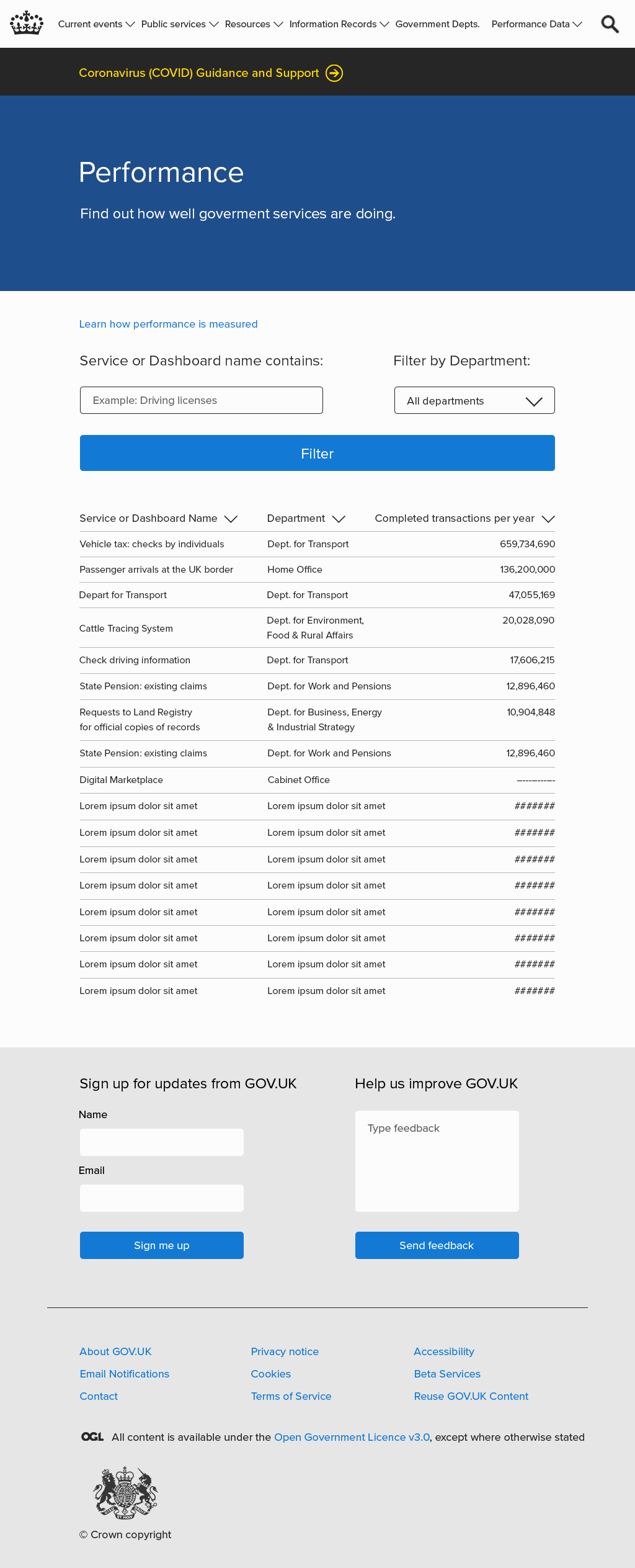
Performance (of government services)
Original Page:
Redesign:
- Organized content by combining the content of two existing pages for “Services” and “Dashboards”
- Allows the visitor to find information on one page, instead of needing to click into subpages with the same content format.
Prototype
Click for Invision prototype (opens in new window)