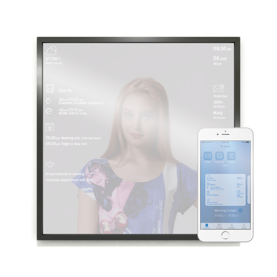
An internet connected mirror displaying tailored useful information
Jump to:
Project Info / Style Exploration / Initial Mockups
Final Iterations – Logo / Icons / Mirror / App
Role:
UI, IxD, Graphic Design
Client:
Windy City Lab
Tools Used:
Adobe Photoshop, Invision
Project
Glance is a voice-activated smart mirror created by Windy City Lab (WCL) that displays information in the form of widgets. Its companion app, wireframed by the UX team that worked on Glance previously, exists for the user to customize how the information will be displayed on the mirror. Their target users are high performing professionals, busy travelers, and entrepreneurs.
My team’s goal was to design the styling and branding of the:
- Mirror interface
- App interface
- Widget icons
In tackling the project, we reviewed the UX team’s deliverables. The wireframes for the app contained an idea of its existing content and functioning. There were no wireframes for the mirror interface, so I was excited to design the content for it in addition to its styling.
Style Exploration
In exploring ideas for the look and feel of the product, we focused on key adjectives that came up in the conversation with the client:
- Apple-esque
- Elegant
- Modern
- Relaxing
- Helpful
- Unobtrusive
They also wanted smooth and fluid in terms of animations in the mirror display, and infographic-like, showing data with imagery rather than text. Ultimately, we decided that the most important core values were glanceable and unobtrusive.
My Style Tiles
I created three distinct styles, all of which were minimal to reflect what I envisioned the feel of the mirror to be. I focused more on the look and feel of the mirror since that was the main part of Glance, and included the app elements on the side.
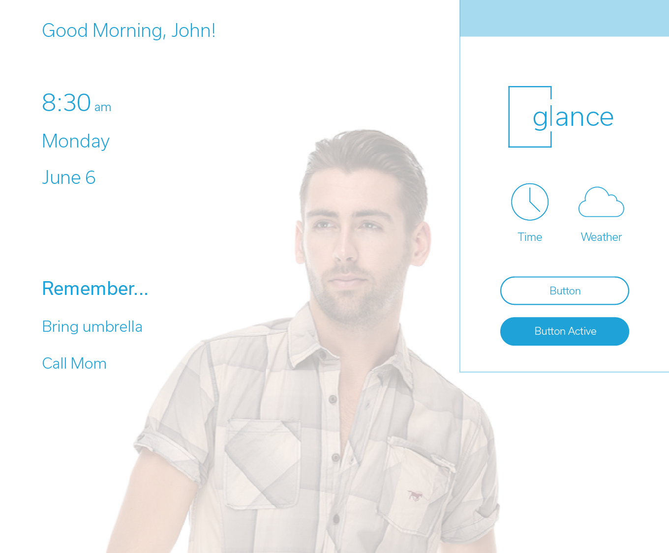
‘Simple and calm’
I imagined the user waking up, glancing at the mirror, and feeling as relaxed as possible. I made buttons that were round to have a soft, friendly feel, and a typeface that was similar to the one used for the existing Glance logo.
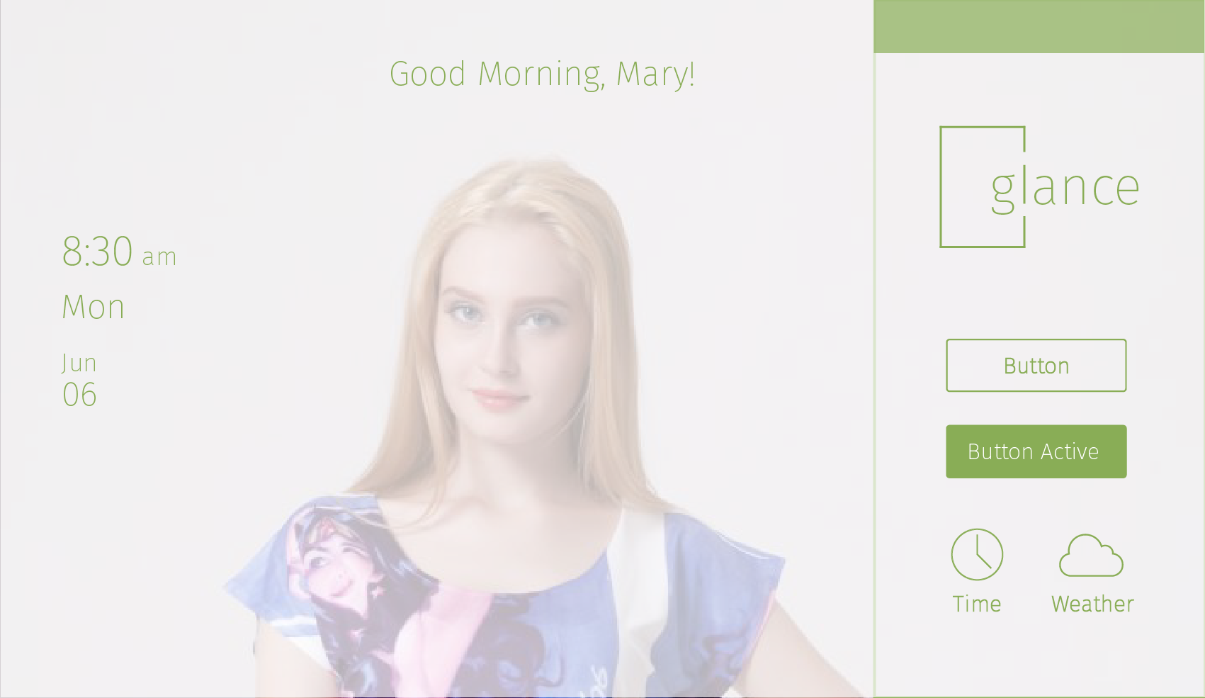
‘Fresh and springlike’
I focused on the feelings I imagined the user having when waking up in the morning. I used a typeface that looked casual but elegant.
‘Sleek and efficient’
Since the target user was a high-performing professional, I strived to have the user feeling competent and ready to go when starting the day. I used a condensed typeface for a more serious, technological feel.

Client Feedback:
The client liked the icons I chose because of their minimal style. They also liked the typeface I had on my “fresh and springlike”tile (Fira Sans), which I used as a guiding factor for my design.
Initial Mockups
We focused on the mirror interface and the key screens of the app’s user flows. In designing content for the mirror display, I tailored the language I used so that it was glanceable, easy to understand, and provided what was most useful and important to the user at the moment.
Icons
We decided to make the app icons for all seven of Glance’s widgets. To find ways to distinguish my Date and Events icons from each other, I tested different versions with people. Many of them said they looked like calendars, and overall inconsistently distinguished one from the other.
Tested various looks:


Mirror
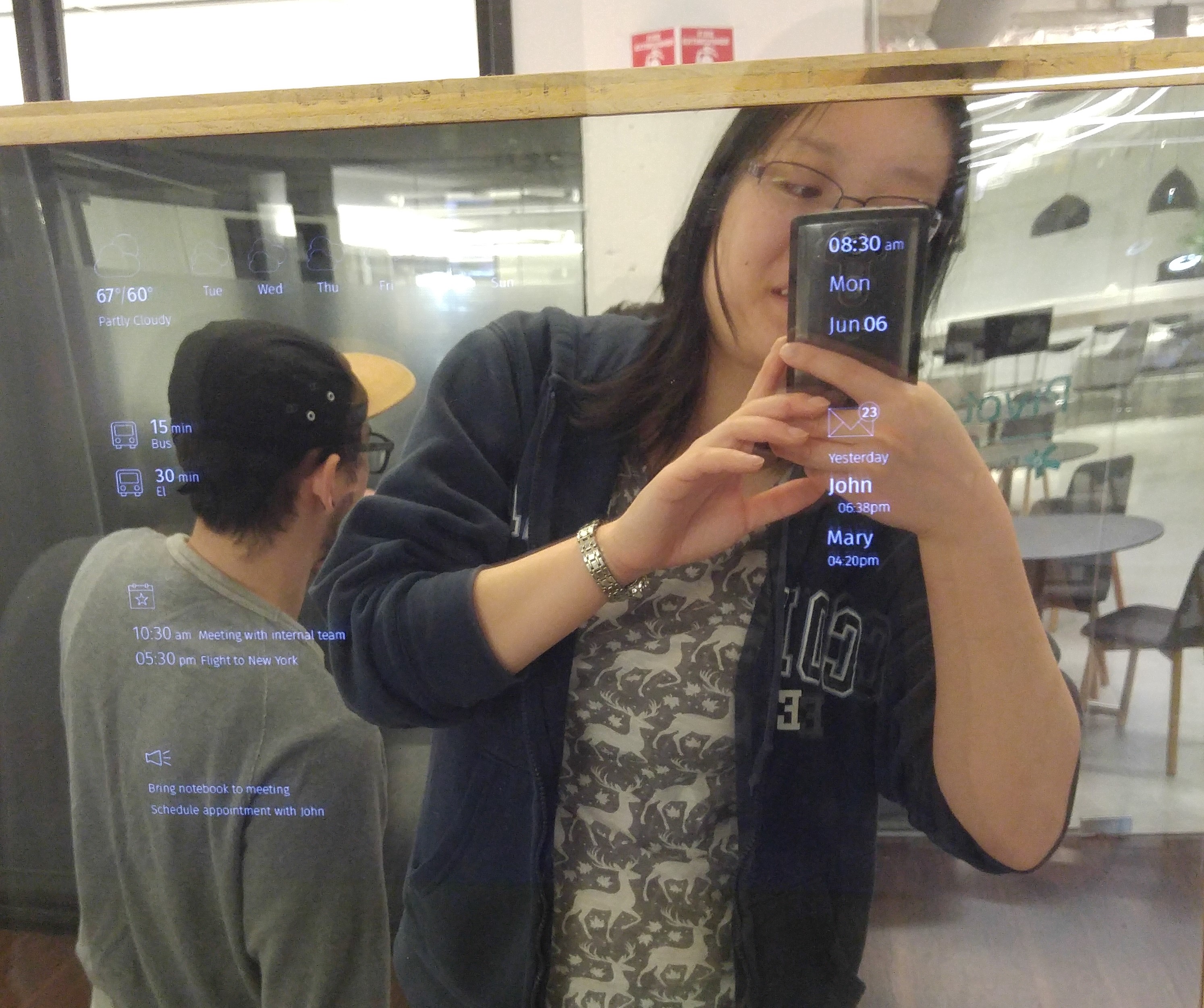
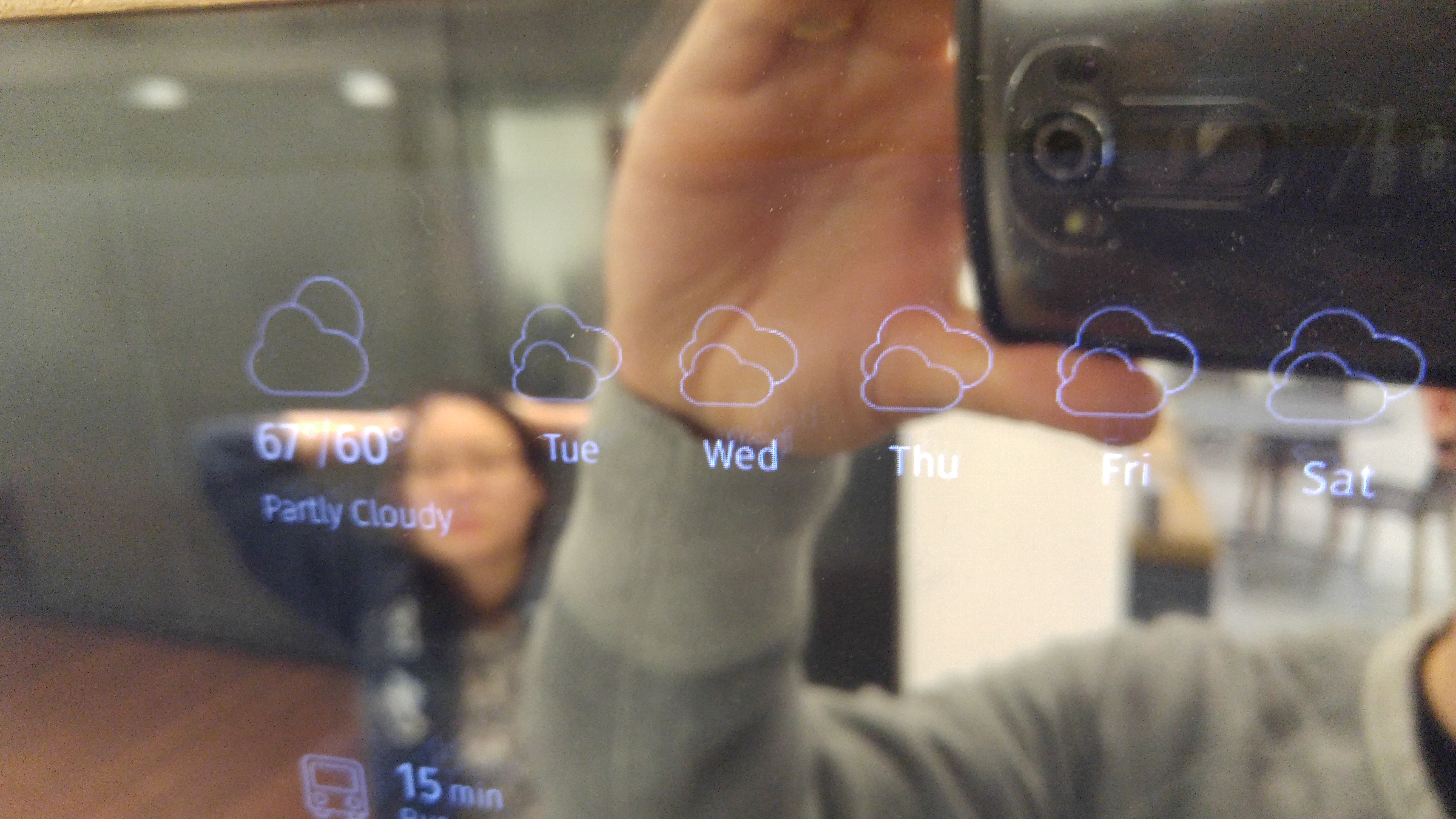
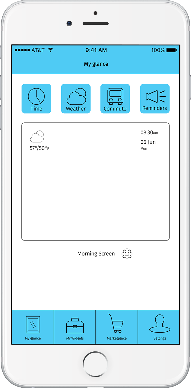
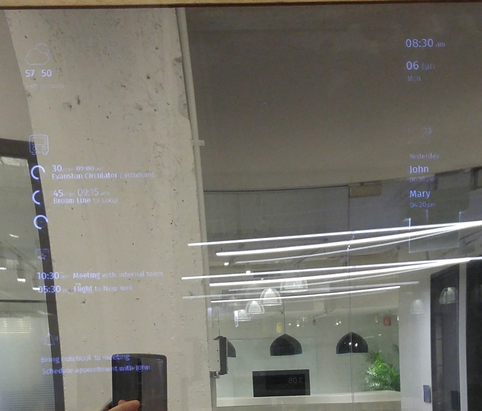
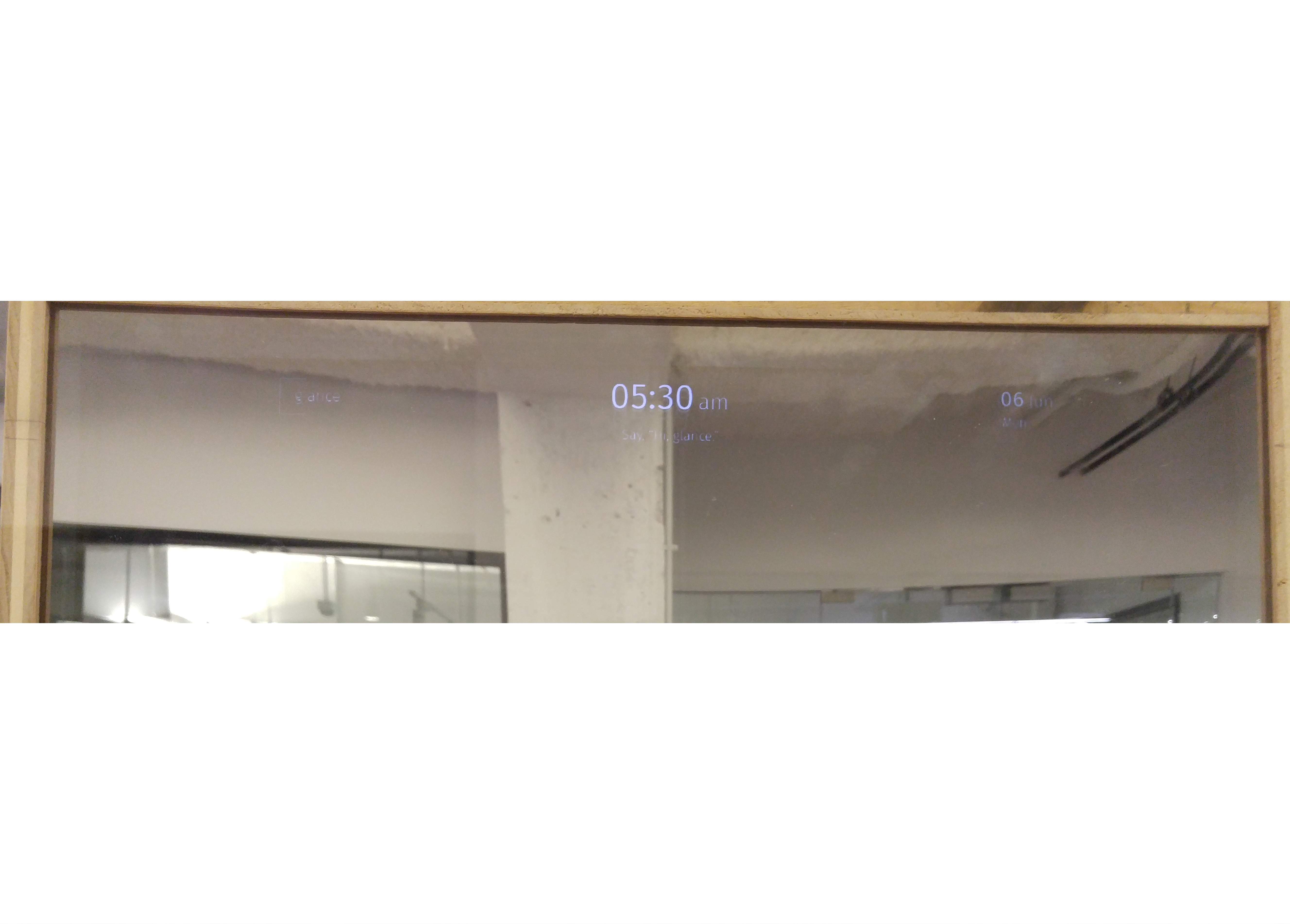
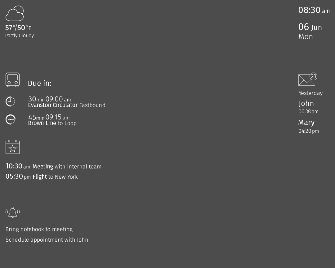
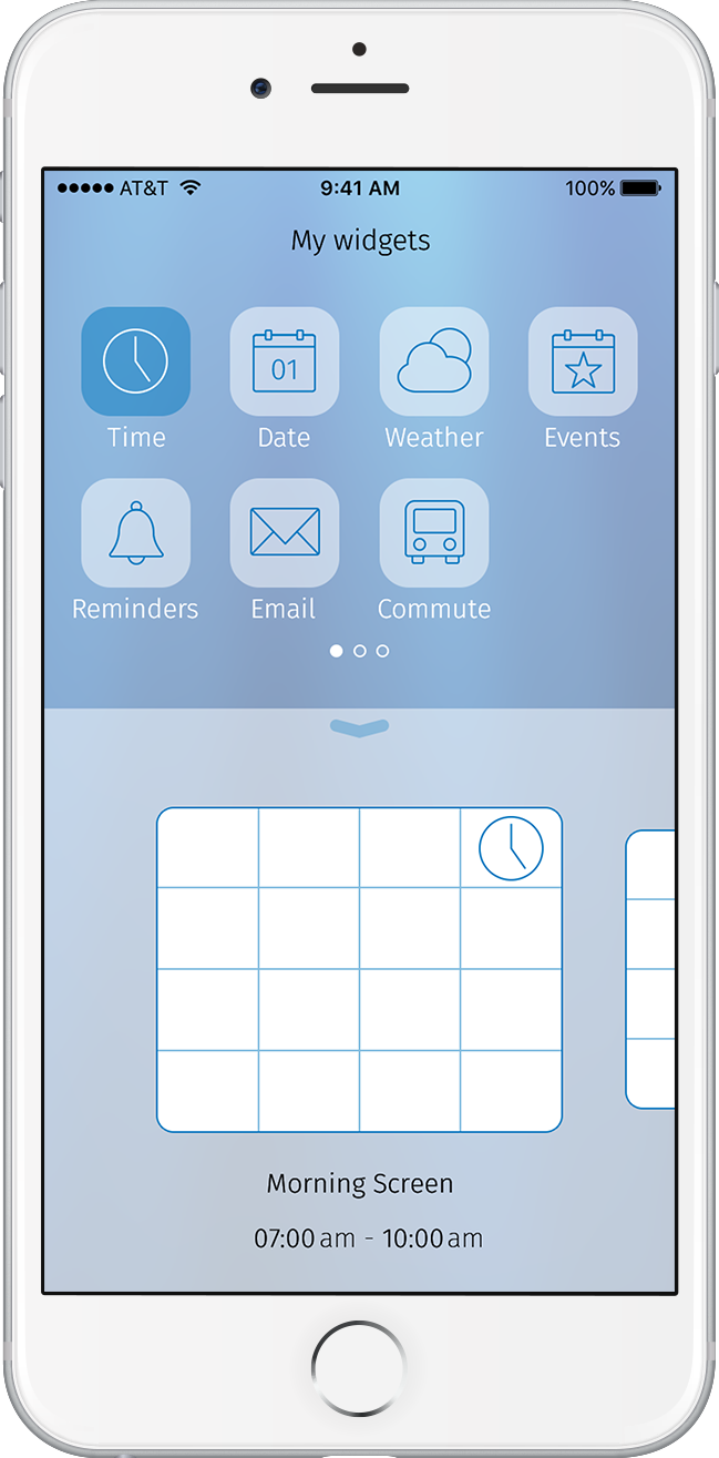
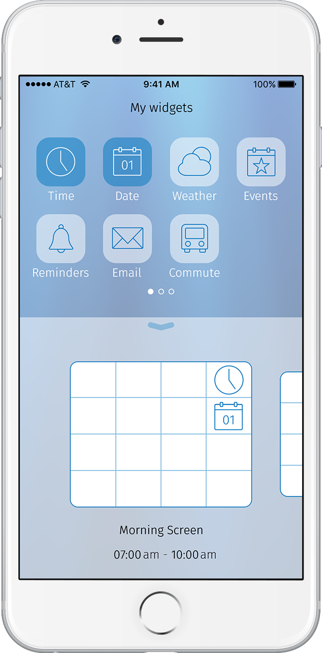
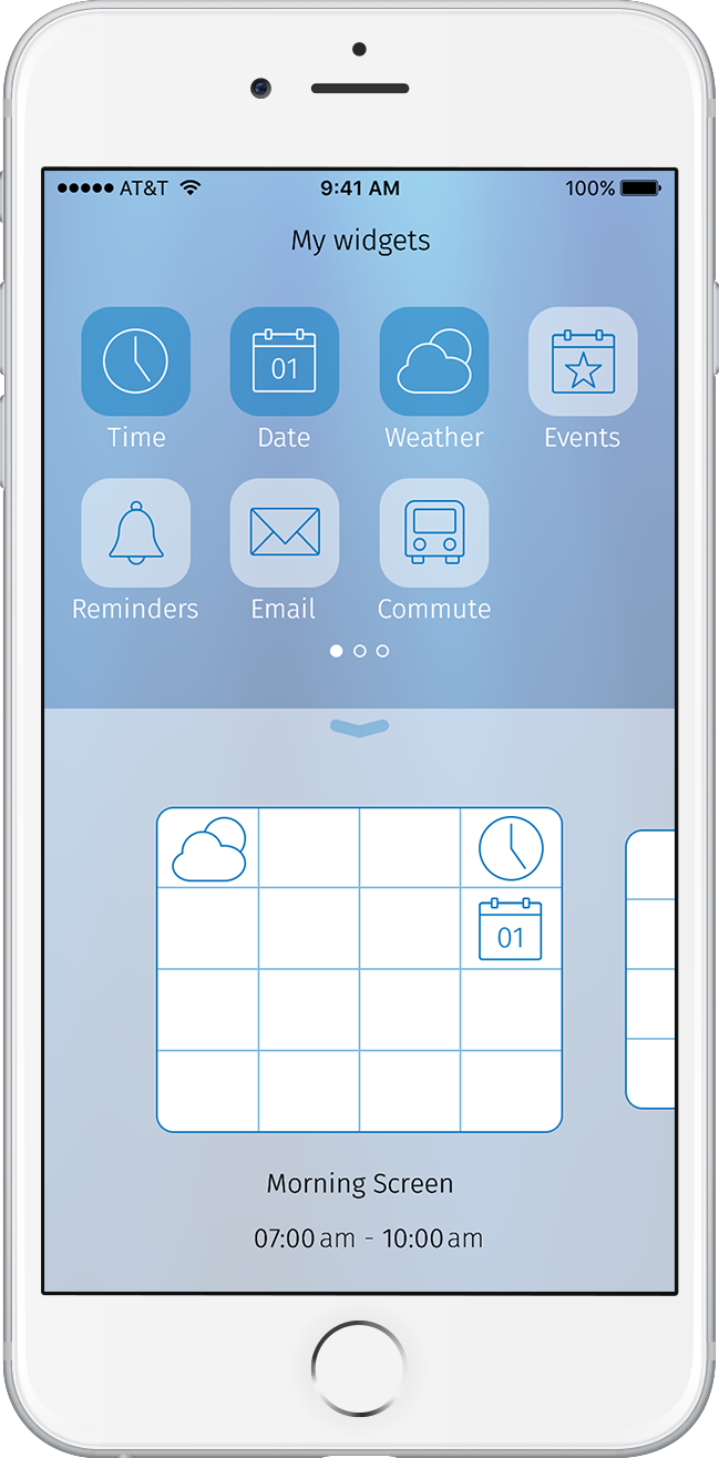
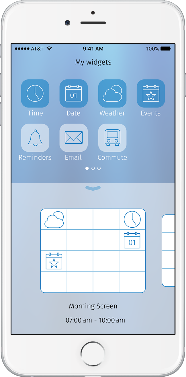
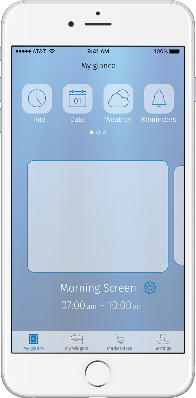
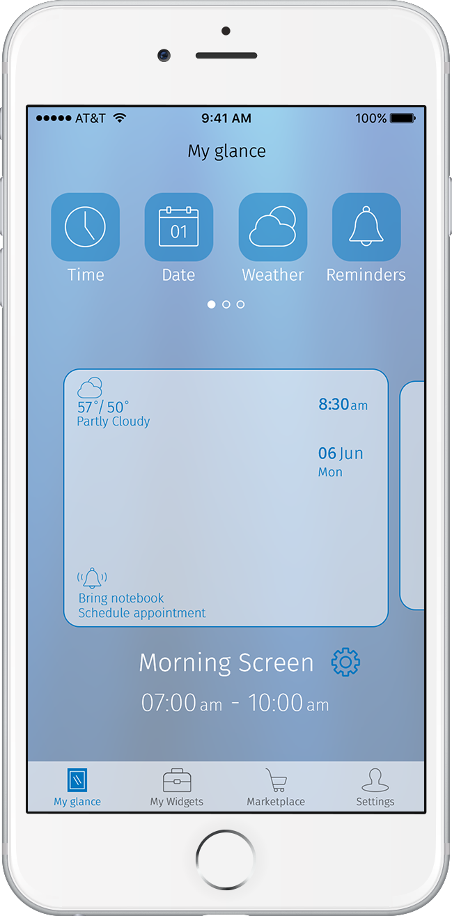
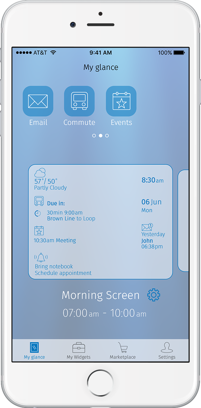
During this sprint, I designed the Home (Main) display of the mirror, which displays top-level information the user sees when it first activates, and an Expanded state, which shows more extensive information of a widget that was on the Home display.
Home Display
Throughout the process of designing the mirror, I moved the elements closer to the edge of the screen, deciding there was already enough padding between the edge of the actual mirror and edge of the display. I also wanted the user to be able to see themselves sufficiently, like a mirror should allow.
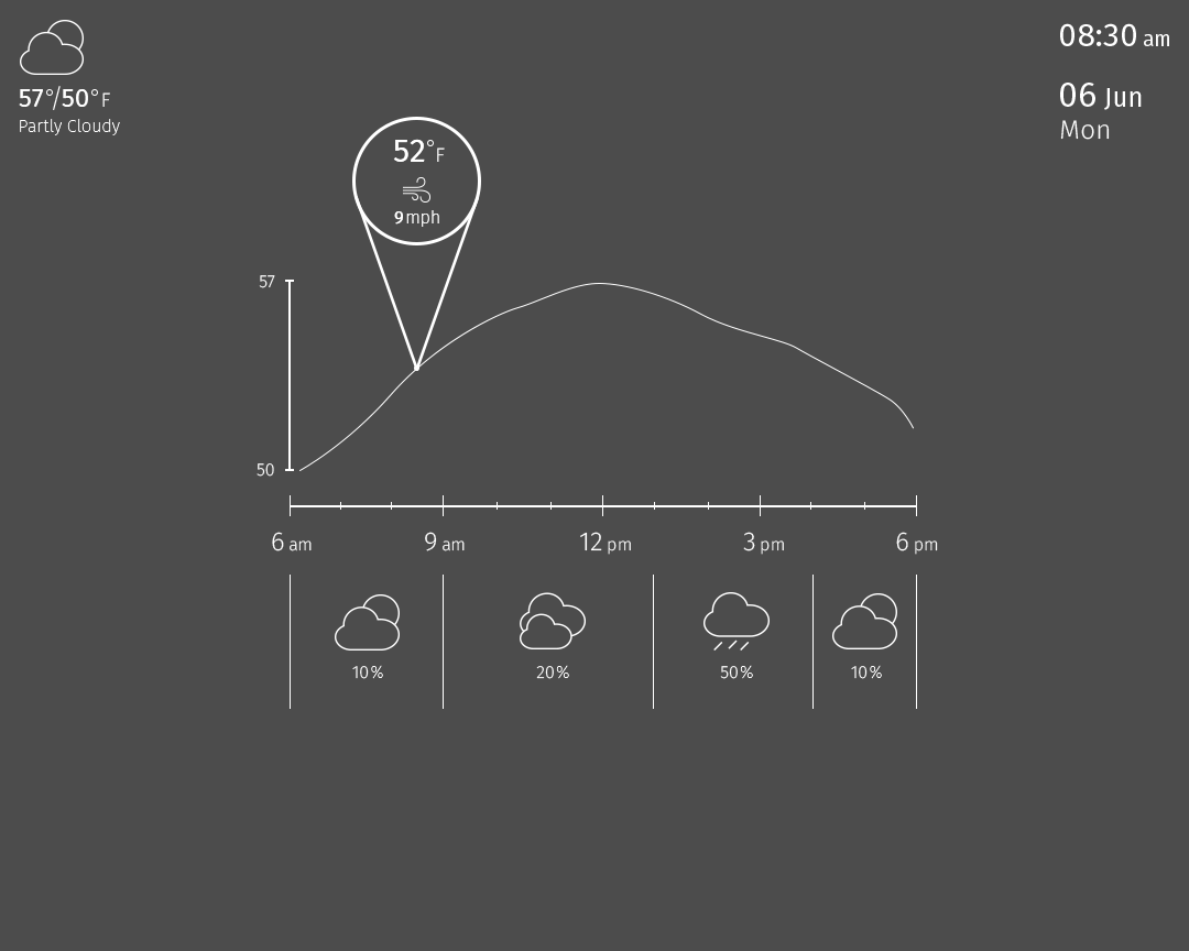
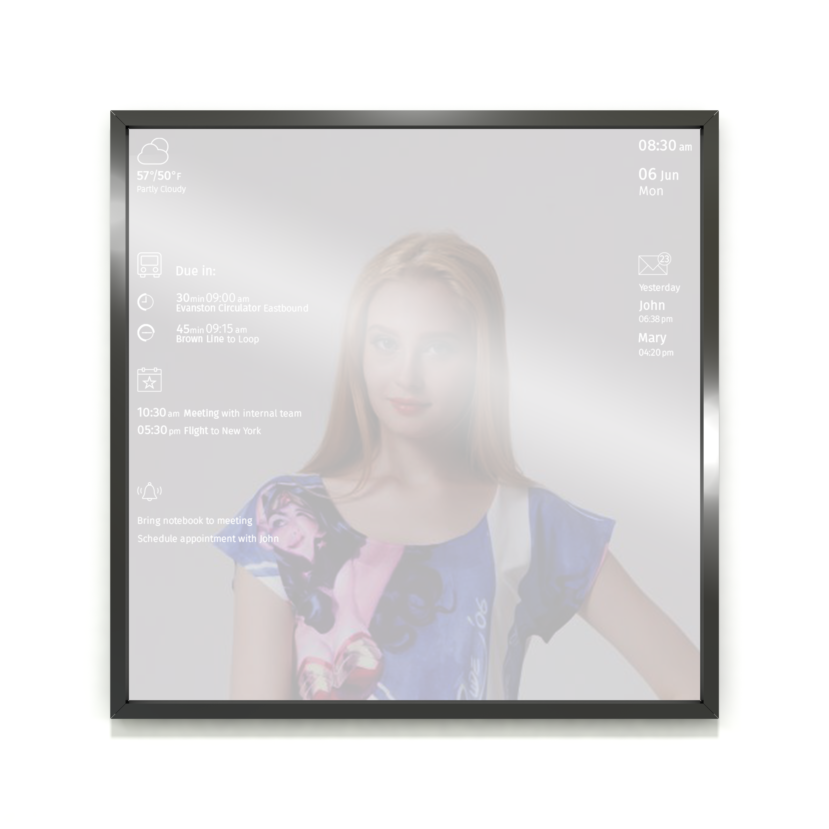
Expanded Weather Display
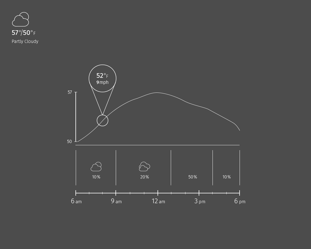
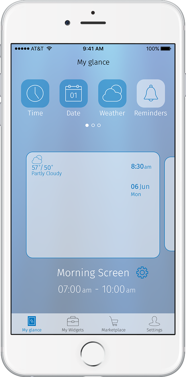
The infographic of the weather projects and expands from the Home display’s Weather widget as a fluid animation. Because this display’s information was more detailed, I kept in mind what takes the least time to look at but still includes the necessary information for the user.
Mirror Testing #1
I tested my Home display design on WCL’s prototype mirror. It was different seeing my design on a real surface rather than my computer. After this test, I bumped up the font and the stroke weights of the elements to make them more visible, as well as iterated on the information shown.

Client Feedback:
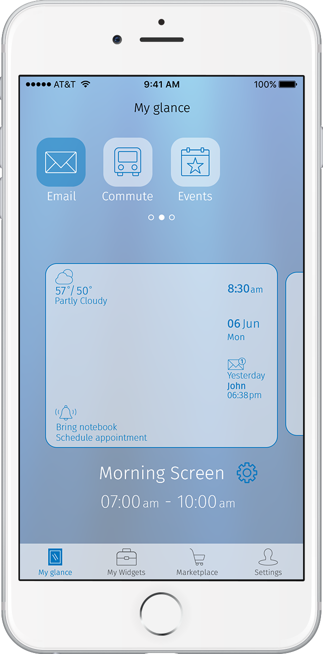
The client liked my font choice and how I bolded certain words for emphasis. They also liked the idea of the customizability of the Email widget to show only emails of people important to them. During our presentation, they mentioned to us that for the Commute widget, they wanted a visual instead of just numbers to show the time the user had left.
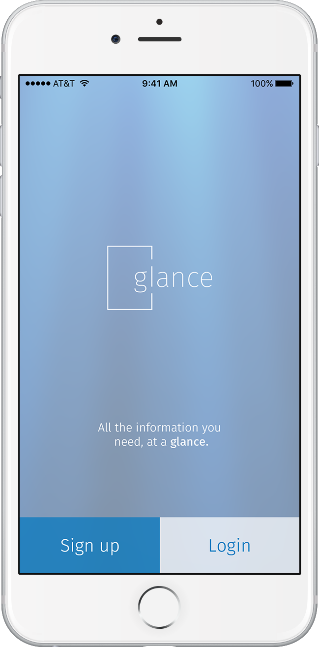
App
Going off the wireframes, I created the key screen of each of the two most important flows—the Homescreen and the My Widgetsscreen.
In the Homescreen, the user creates and customizes a new mirror interface, or “screen.”
Wireframe
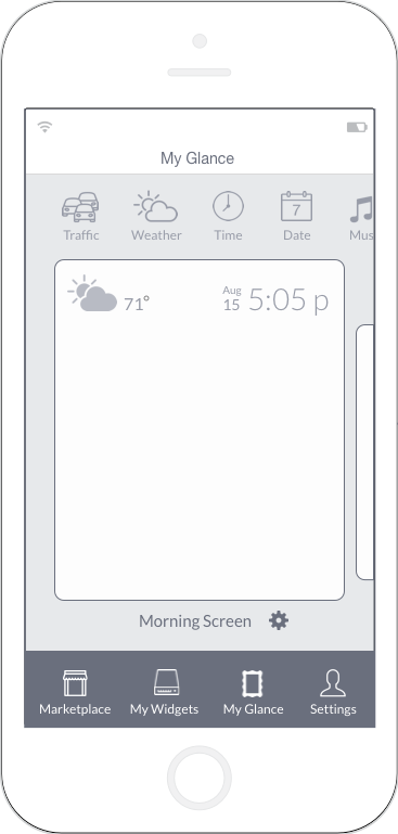
Initial Mockup
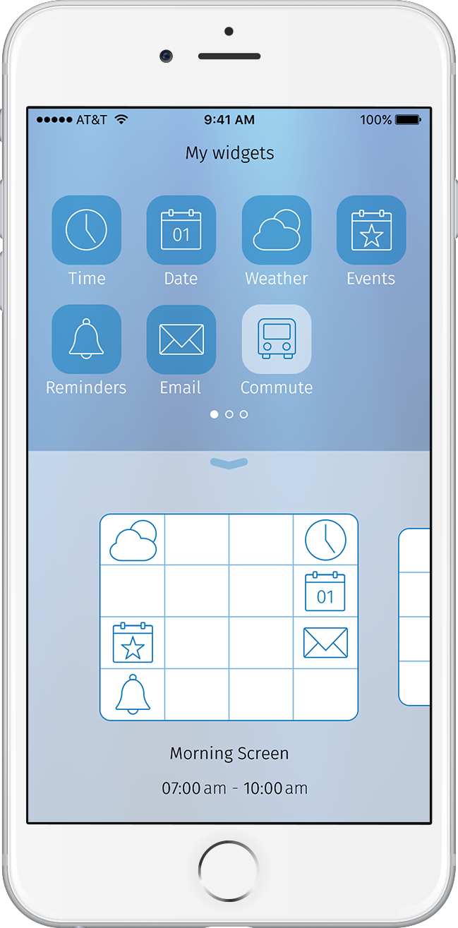
The My Widgets flow focuses on the action of dropping the widgets in boxes representing the different mirror states.
Wireframe
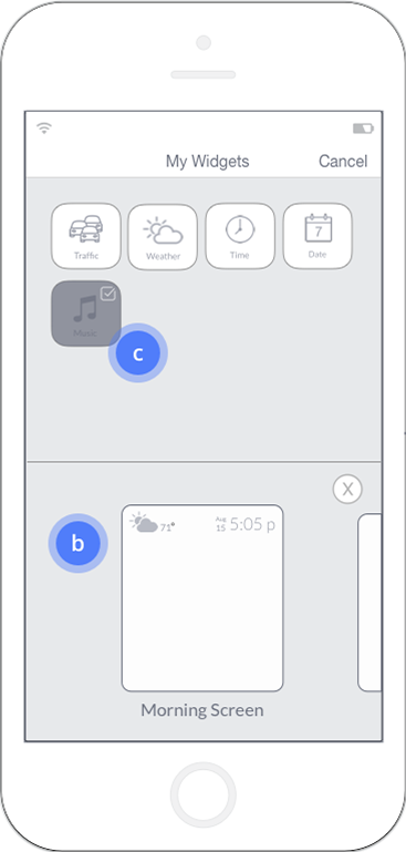
Initial Mockup
Client feedback:
The client liked that I showed a preview of a mirror display within the app. We also all agreed that the two key flows from the wireframe had some redundant features, so I created more distinction between them in my next sprint.
Final Iterations
After presenting our ideas to the client, I built out the app’s key flows and iterated on my mirror display, logo, and icon designs.
Logo
I made the mirror version of the logo thicker to ensure visibility, but the app version thinner to maintain the elegant feel.
Mirror
App
Icons
I finalized my icon design after several iterations, ultimately making them look sleeker and more elegant. My Reminders icon looked like it was shouting at someone before, so I changed it to something gentler.


Mirror
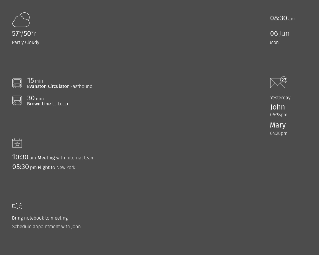
As with the earlier draft of the mirror, I tested my display on WCL’s prototype after iterating. After, I again bumped up the weight of the elements’ strokes and text. They all needed to be at least two pixels thick to be legible enough.
Mirror testing #2
Home Display
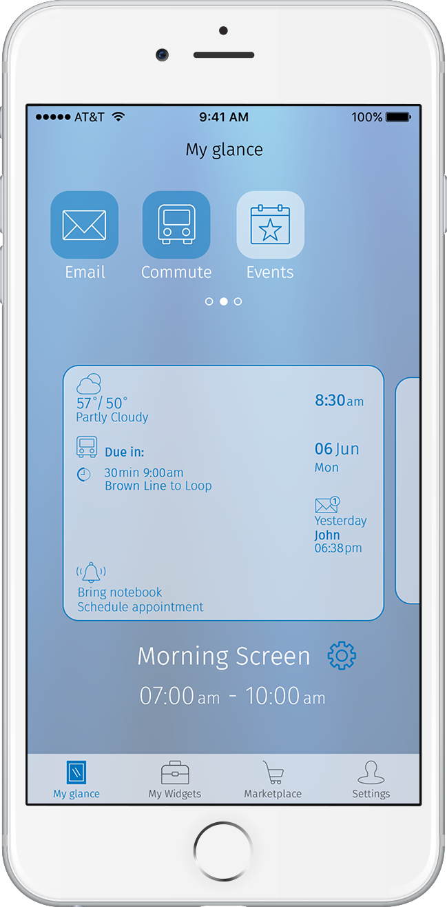
As per the client’s feedback, I created icons representing the time left until a train or bus arrives. I also made the hierarchy of the elements clearer.
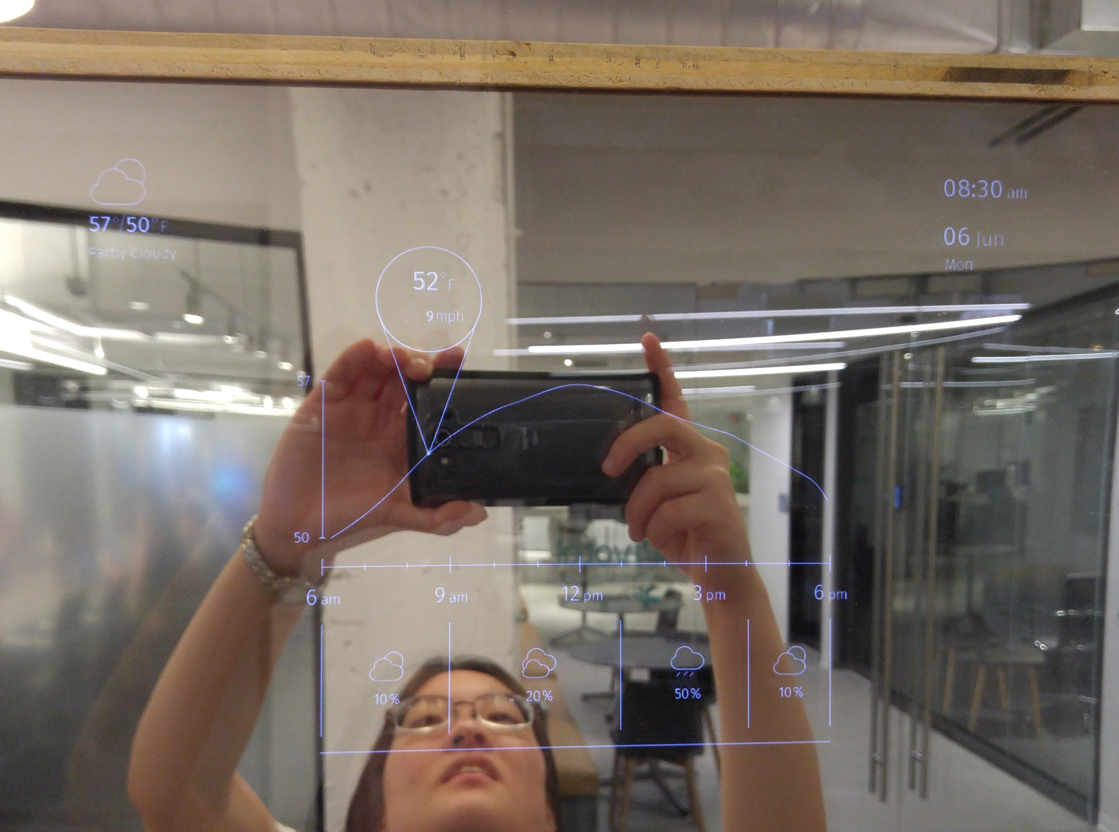
Expanded Weather Display
I made more important elements more prominent and cleaned up the design to make it easier to look at.
Inactive Display
I created the Inactive State, which I imagined the user seeing after waking up late at night, tired. I included only the information I felt was important at that time. This was the only state in which the logo didn’t take up space unnecessarily. I included hint text to be straightforward in telling the user how to activate it.
After testing the display, I realized it had a lot more room than the other mirror states, and that the user was still able to see themselves even after I made the elements larger.

App
I changed the app’s look and feel to be more dynamic and less brightly saturated. I imitated the iOS7 frosted glass effect to create a softer, gentler look and emulate the feel of a mirror: foggy, semi-reflective glass.
I also established a difference for the two flows so that it made more sense for them to be separate.
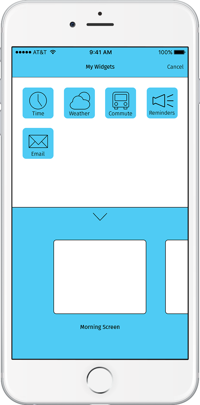
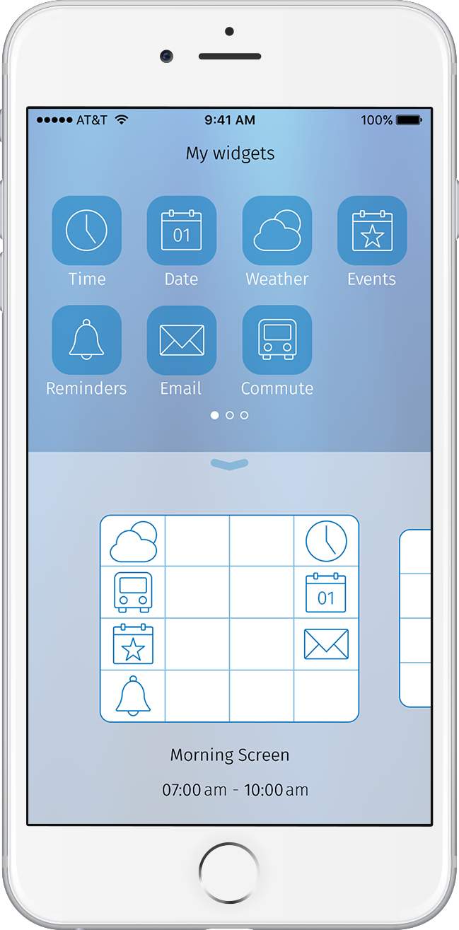
In the Homescreen, I designed it so that when the user drags around the widgets on the mirror screen, they snap to a four-by-four invisible grid.


I included a visible grid in the My Widgets flow to make the flow’s function like dropping icons into a bucket.


Full flows
Adding widgets:


Creating a new mirror screen:


Interactive Prototype:
Click for Invision prototype (opens in a new window)
Style Guide
One of the final deliverables was the style guide to pass on to the developers. I wrote out the constraints I had while making the display, as well as guidelines that were dependent on specific variables in my design.
Next Steps
Our client liked our ideas and will decide how to integrate our UI’s in their product. They envisioned the mirror being produced in different sizes and used in places like hotels and high-performing individuals’ homes.
Future considerations we had for Glance:
- Simplified flow—reducing the number of steps, or screens, required to complete a task
- Widget settings—enabling the user to customize how various individual widgets will show their information
Insights
Some of the things I learned during this project:
- Throughout the process, it was easier to have a direction when I had a potential user in mind. Doing things for others kept me focused and motivated.
- In creating a group of designs like icons, it helped to allot strict time boxes for each step (each individual icon), enabling me to churn out many designs in a short amount of time.
- It was useful to keep note of the reasons for design decisions because it easier to explain them later.
- Requesting feedback or guidance provided other perspectives, which was useful in making decisions.

 AZ
AZ 